Full brandingCafé & espresso barRustic modern
Coffee Bar
A neighborhood espresso bar that needed one cohesive identity — logo, stationery, packaging, social and web — instead of the mismatched, DIY look most independent cafés end up with.
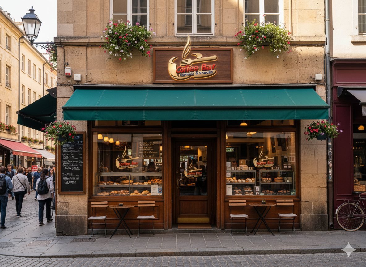
A neighborhood espresso bar that needed one cohesive identity — logo, stationery, packaging, social and web — instead of the mismatched, DIY look most independent cafés end up with.
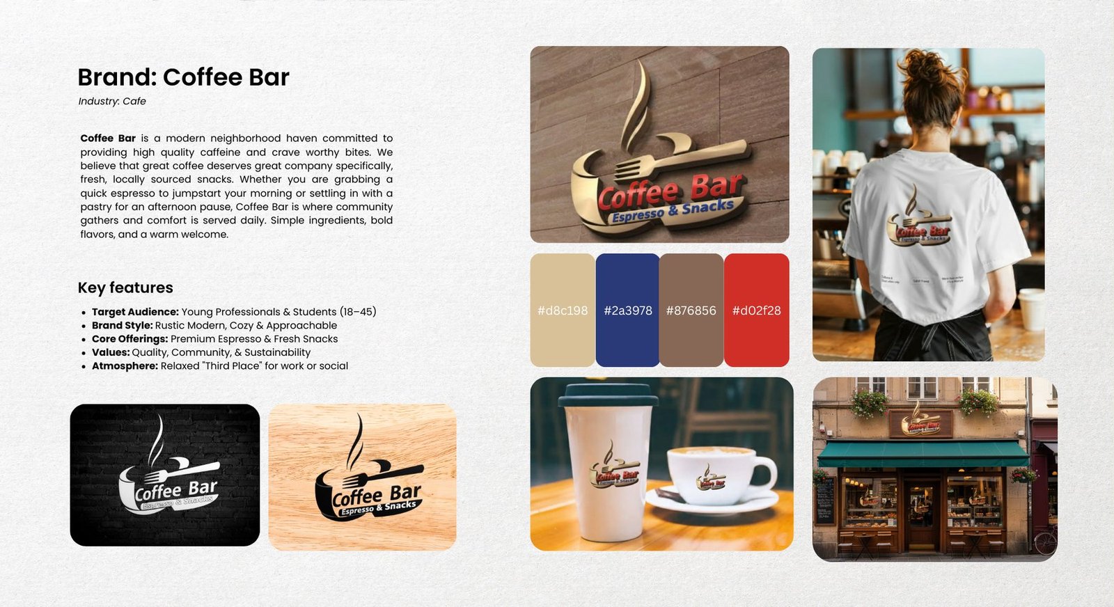
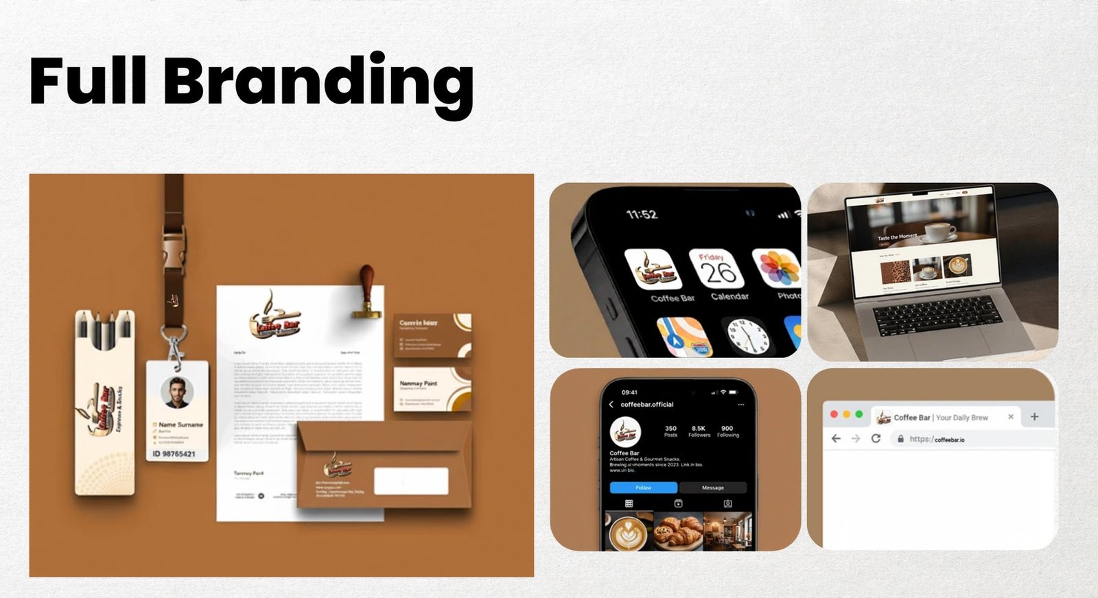
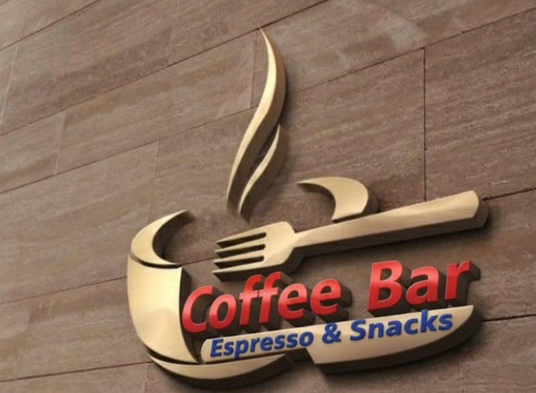
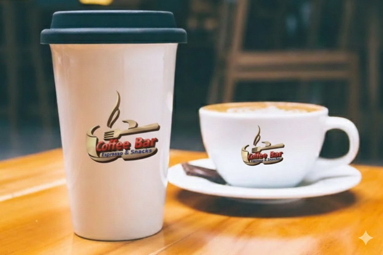
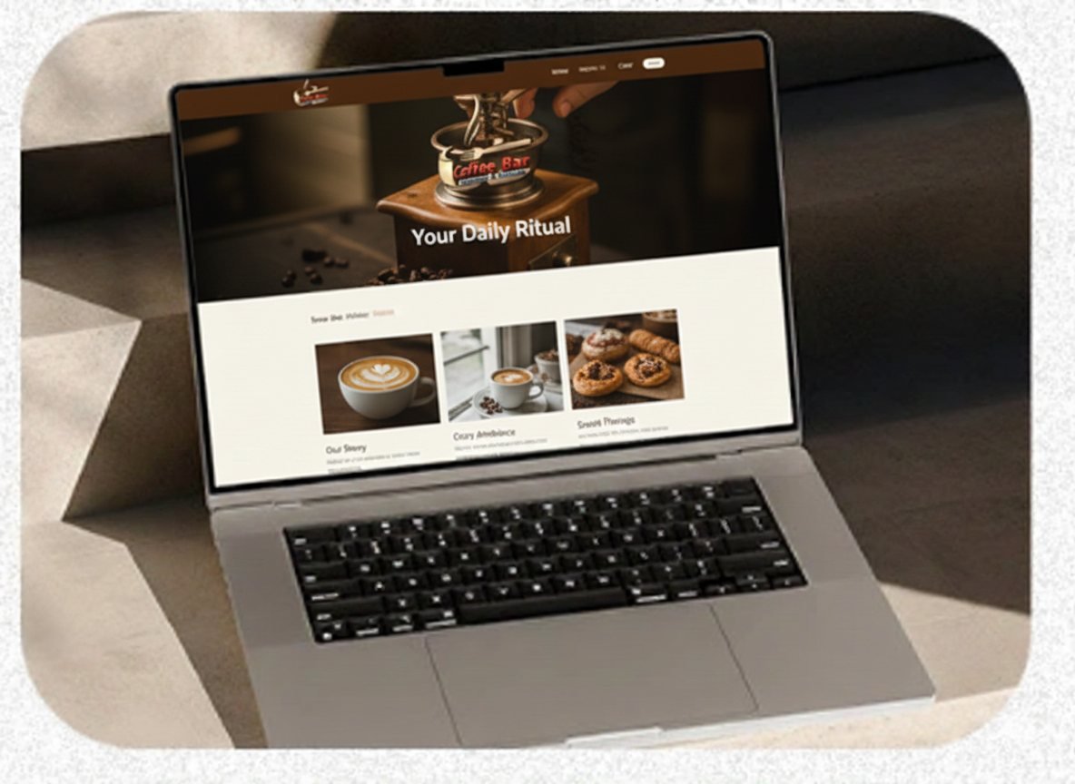
Coffee Bar wanted to be the neighborhood's "third place" — somewhere that feels as good for a solo espresso as it does for an afternoon with a laptop. We built a warm, rustic-modern identity around a gold coffee-cup-and-fork mark, a four-colour palette (tan, navy, brown, red), and carried it across every touchpoint a real café actually needs: signage, stationery, packaging, social, and a website mockup — so the brand looks the same whether you're ordering in person or scrolling their feed.
Two presentation boards summarizing the identity, palette, and every application.
Claim a free redesign of your own homepage — no deposit, no obligation.
Get my free redesign →Send us your link and we’ll redesign your homepage before you pay a cent. No deposit, no obligation.
Get my free redesign →