A Dubai-based holding company operating across three very different industries — investment, technology, and petroleum — needed one master brand system flexible enough to cover all three without looking like three unrelated companies.
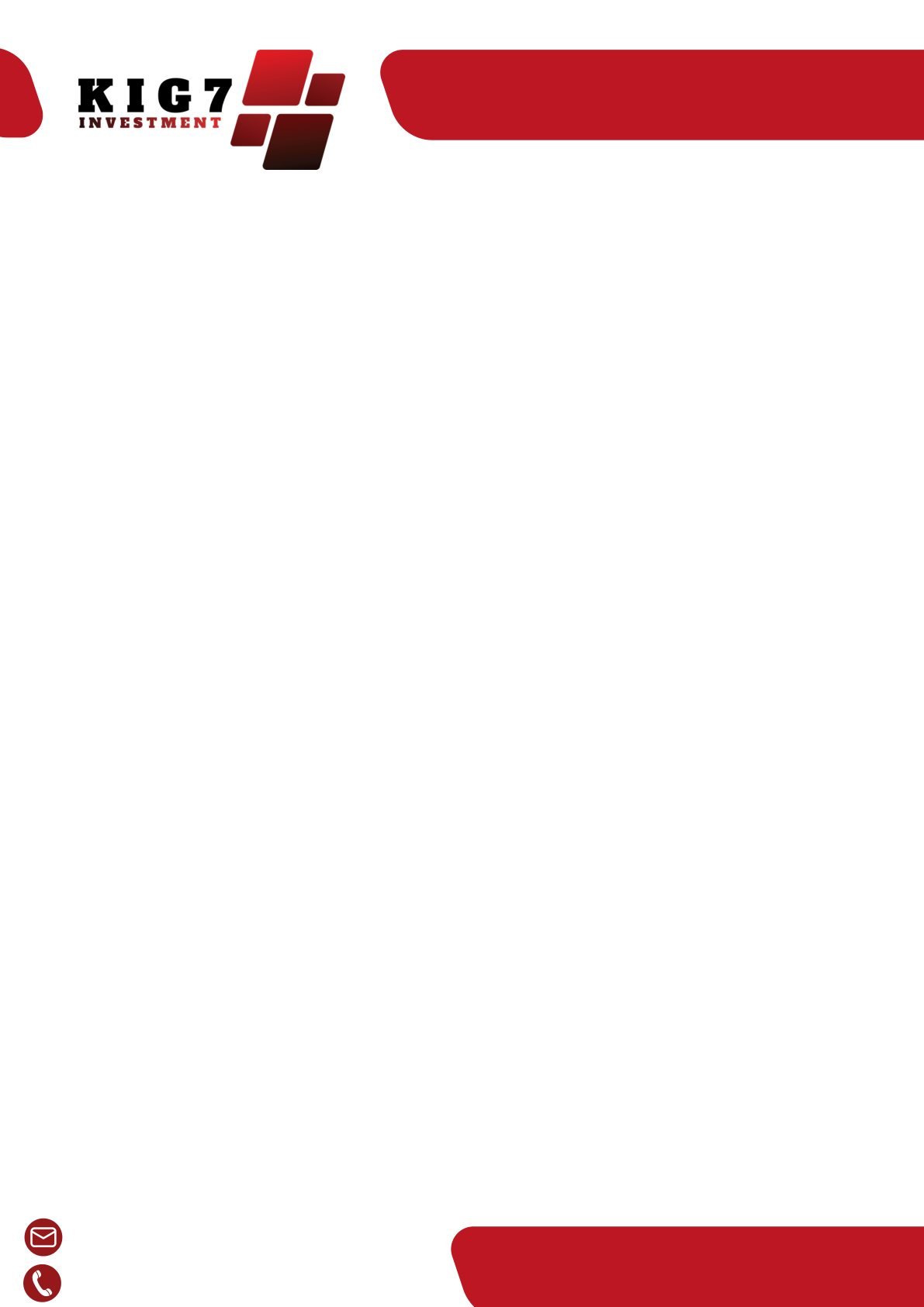
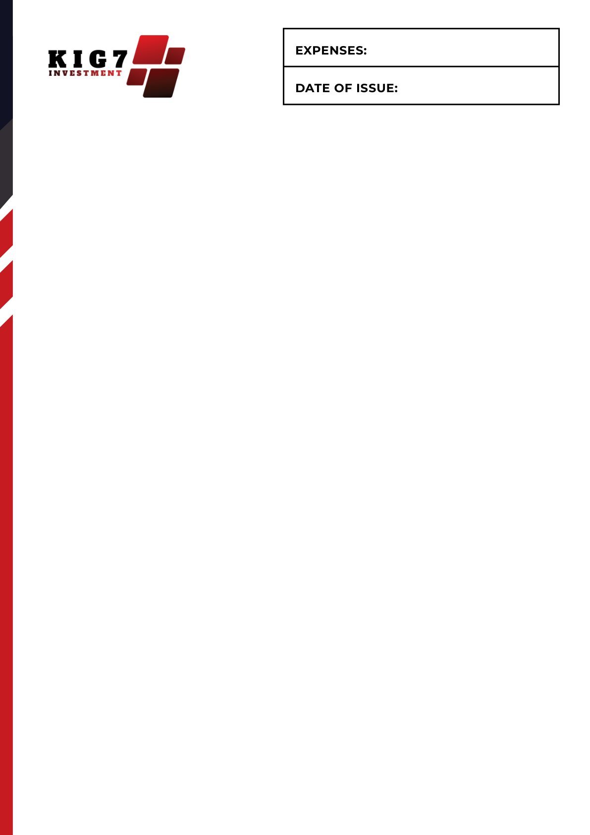
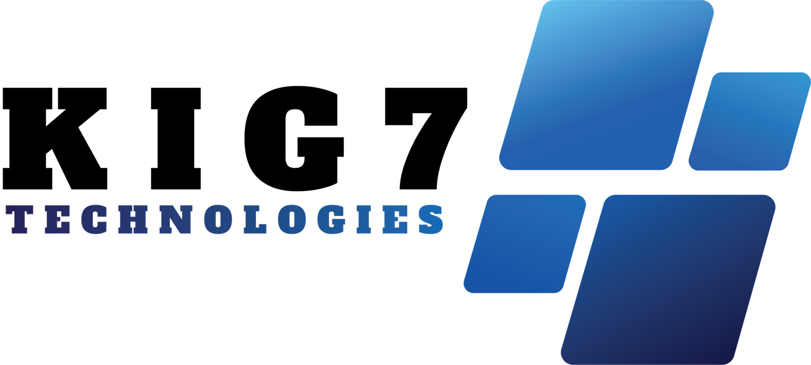
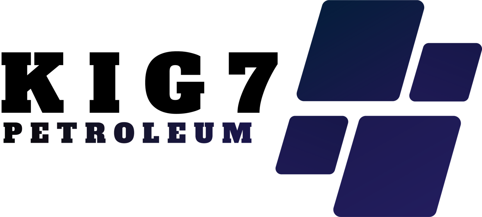
Rather than design three unrelated logos, we built a single geometric construction — a bold "KIG 7" serif wordmark paired with an angled gradient flag mark — and let colour do the work of telling each division apart: navy for Petroleum, blue for Technologies, red for Investment. The same layout system then carries through letterheads and stationery for every division, so anything King7 sends out is instantly recognisable as one company, no matter which division it's coming from.

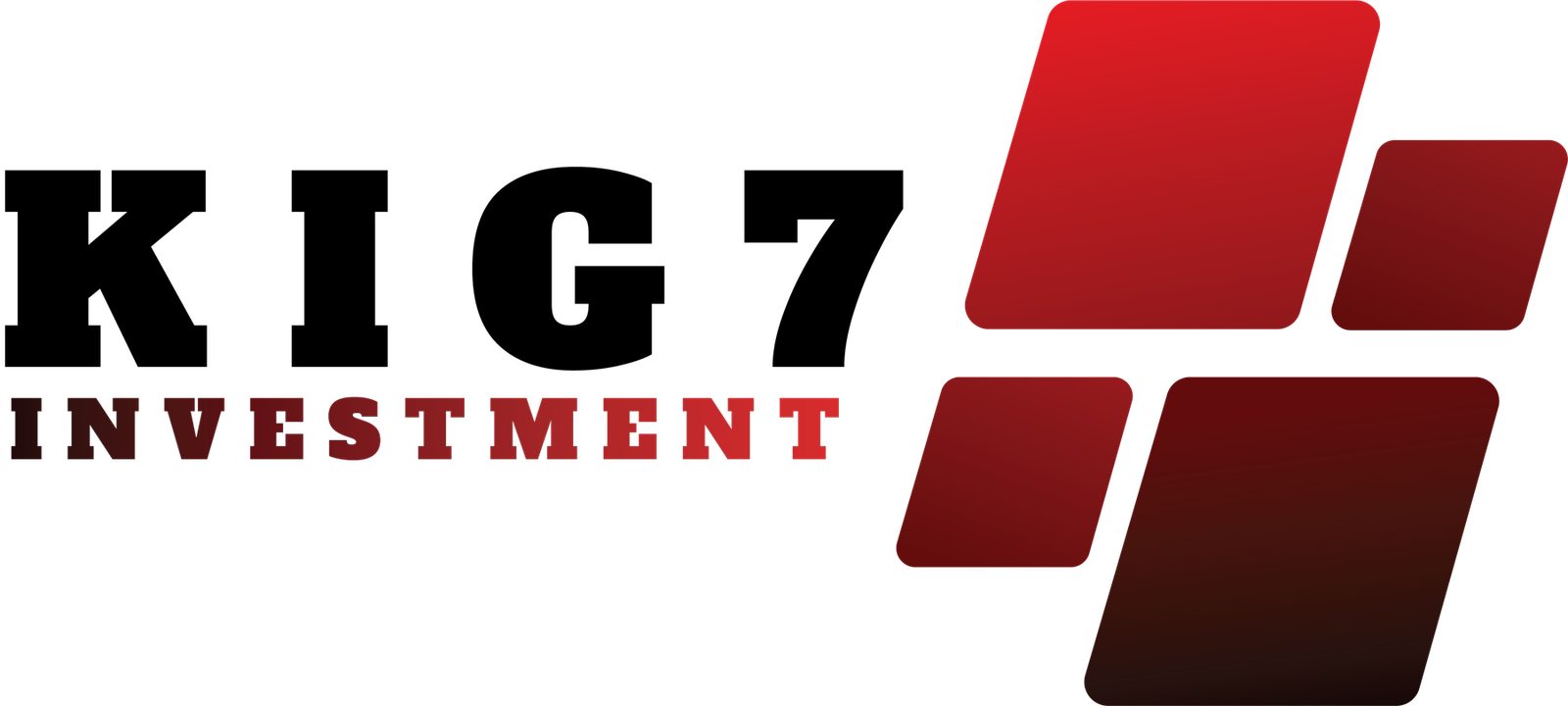
The flagship division — red-to-maroon gradient mark, paired with a matching invoice template and letterhead built for client-facing paperwork.


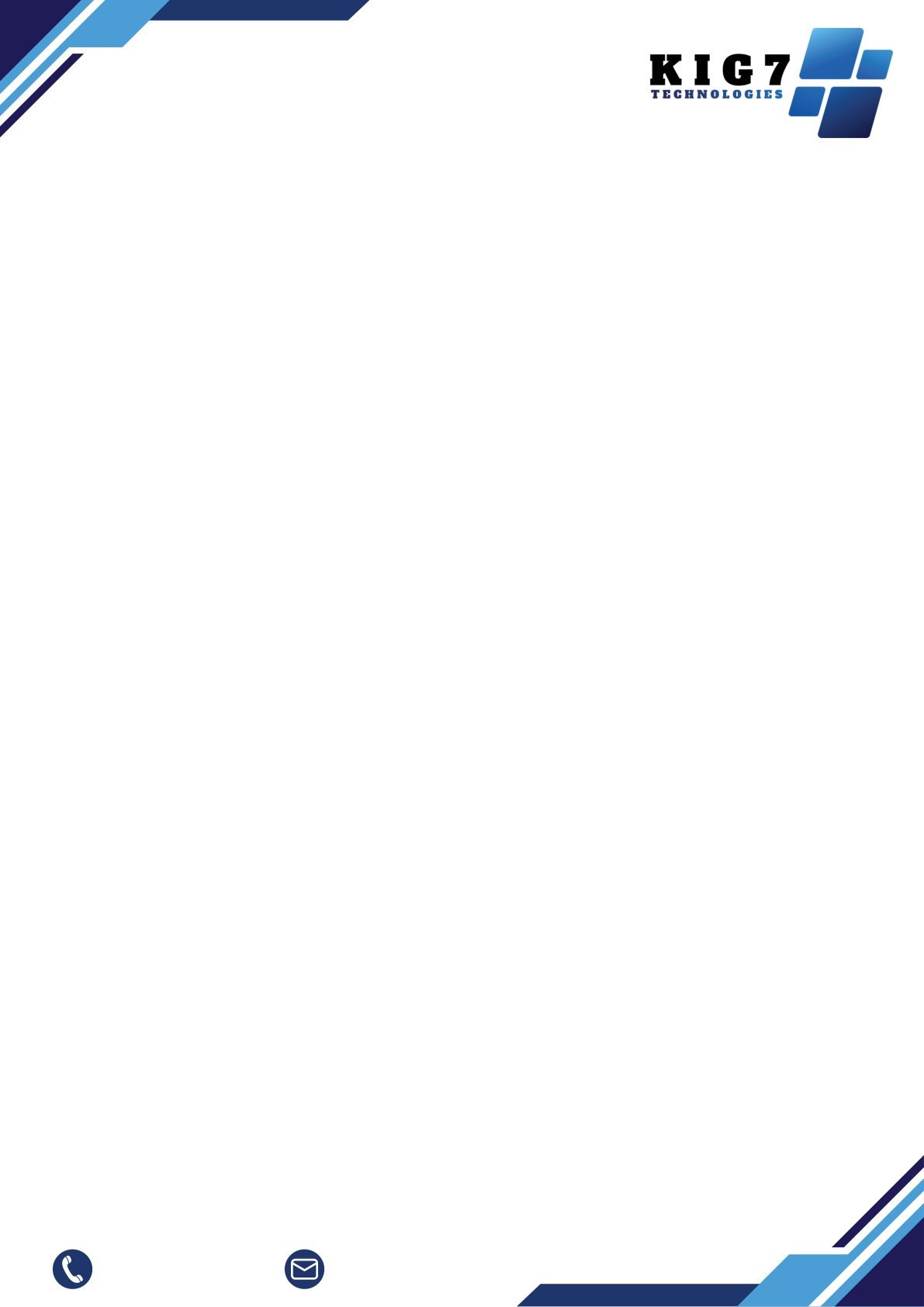
Same construction, cool blue palette — built to read as the more modern, tech-forward arm of the group.


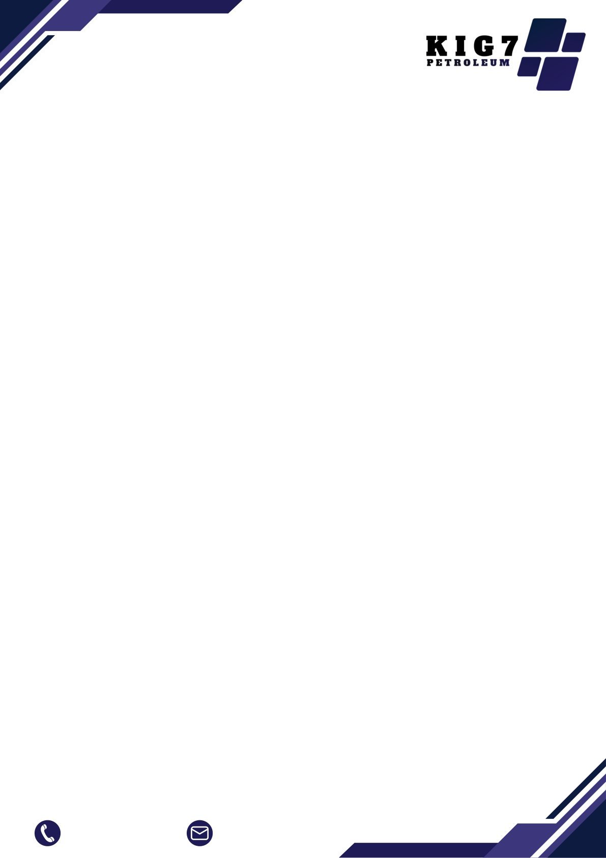
A deeper navy-indigo palette for the energy division — still unmistakably King7, just weighted heavier for an industrial audience.

Claim a free redesign of your own homepage — no deposit, no obligation.
Get my free redesign →Send us your link and we’ll redesign your homepage before you pay a cent. No deposit, no obligation.
Get my free redesign →